Inspiration
When starting to live and study in an unfamiliar city, safety is always an important issue. As an international student in UQ, this sparked our idea of the educational website about teaching students how to deal with emergencies and offences and protect themselves, and we designed and implemented it as a group.
Based on a few interviews of our classmates in UQ we have made, the original idea of the website is to make it a story-based game, so users can learn safety knowledge more engagingly. With the offences rate dataset to keep students to stay alert, and the nearby services location & contact (police stations, hospitals, ambulance stations, etc.) are extracted from datasets respectively to allow users get familiar with their living surroundings. Besides, I searched for relative information and similar websites that might be helpful and came up with potential game ideas that could suit the target user, then discussed with group members to build the design.
Design
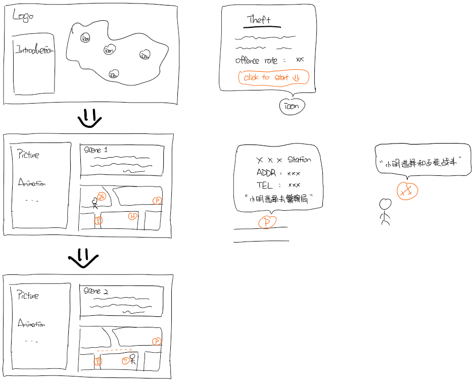
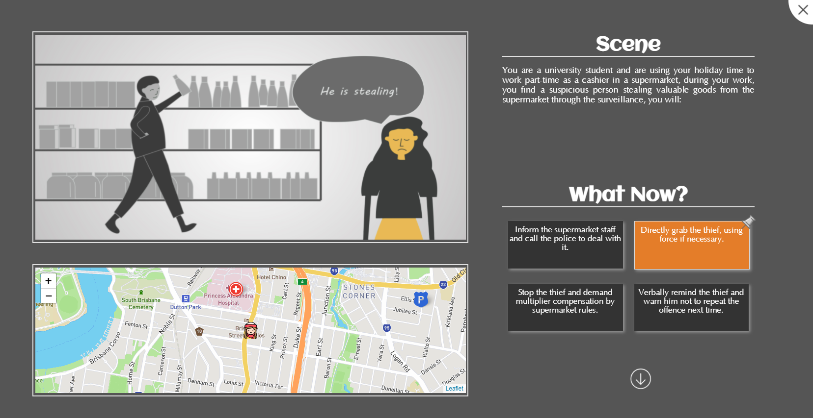
We spent more time designing the game as it is the most important feature of the website. Considering the target users as new university students, the game should be interactive, and the content should be intuitive and contains sufficient safety knowledge. So we originally designed the game as a linear text-based story game with real situations and location, and the story is pushed forward by different choices for users in each plot. And a real map is embedded in the game for users to recognize the important services nearby and make the best choice according to the character's location as well.
I thought about different interactions in the game regardless of the implementation, such as a graphical scene could be intuitive and have a better experience, but still hard to combine with location information and cost more time to create the scene images. While a map-based game could present a holistic and immersion scene and is more interactive than text with each elements and interactions on the map. This was originally adopted after our discussion.
In the meantime, we started to think about the game story, which contains specific offence types chosen from the offences rate dataset. To present positive and helpful guidance for students, we referred to some official websites about Australian law and consulted a friend of ours majoring in law. In this case, the reliability of the game story and options could be ensured.
Prototyping
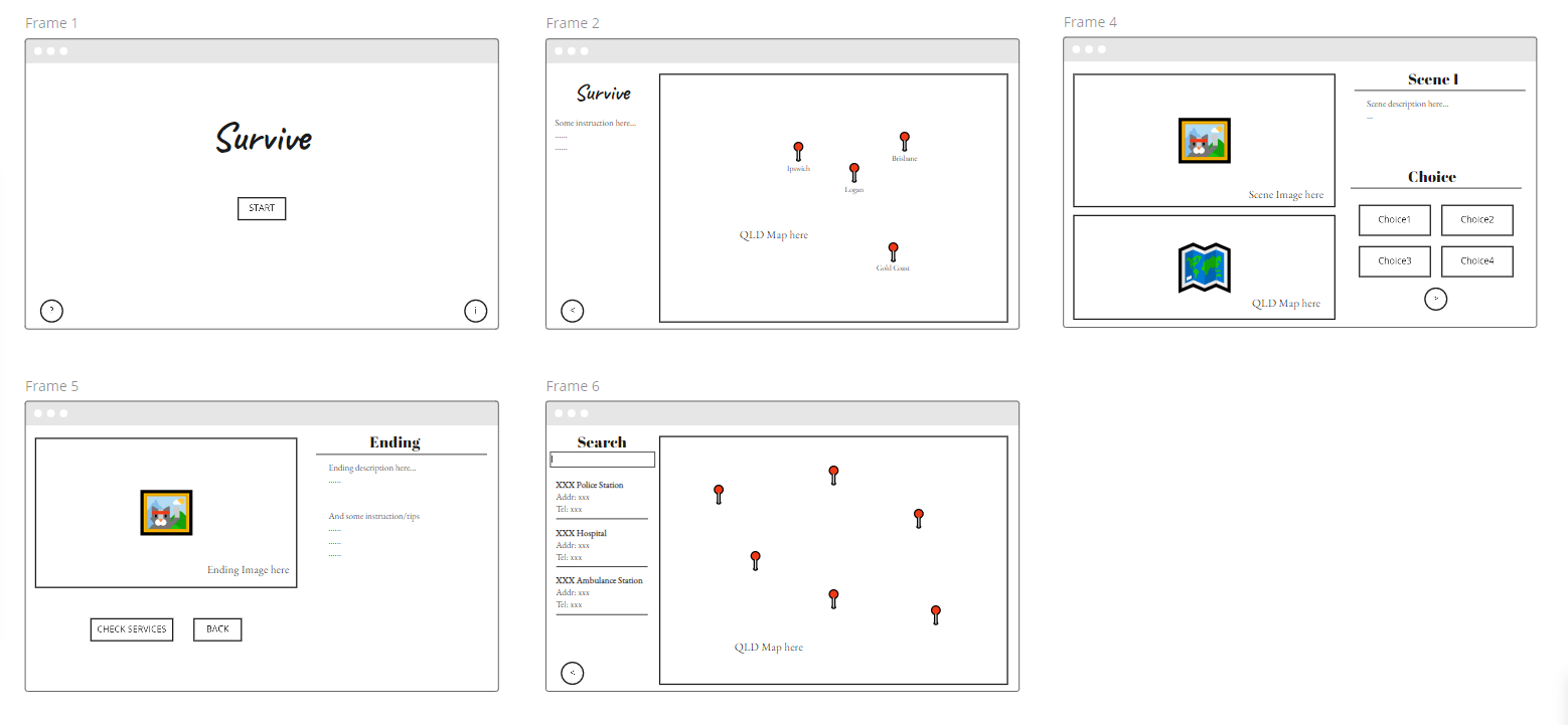
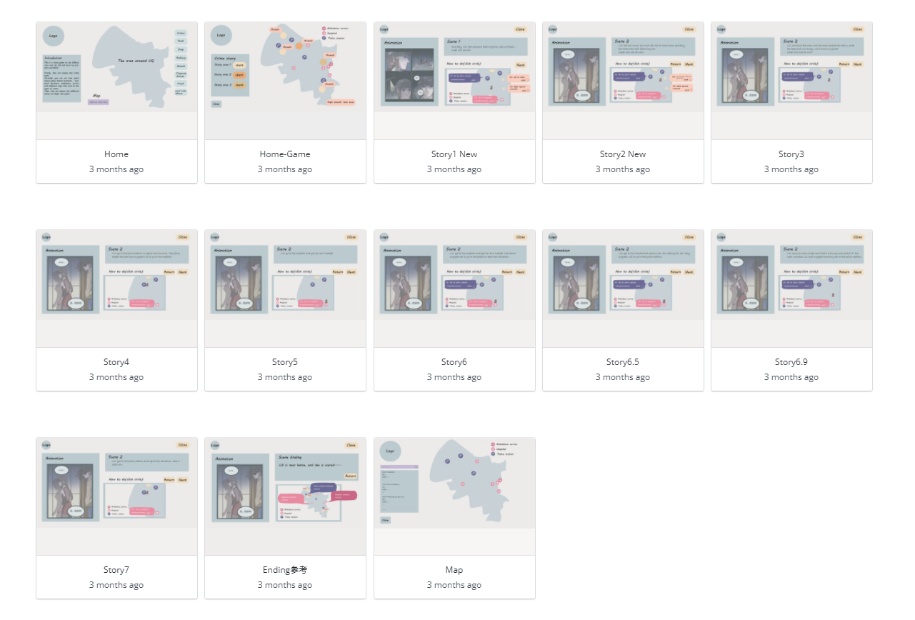
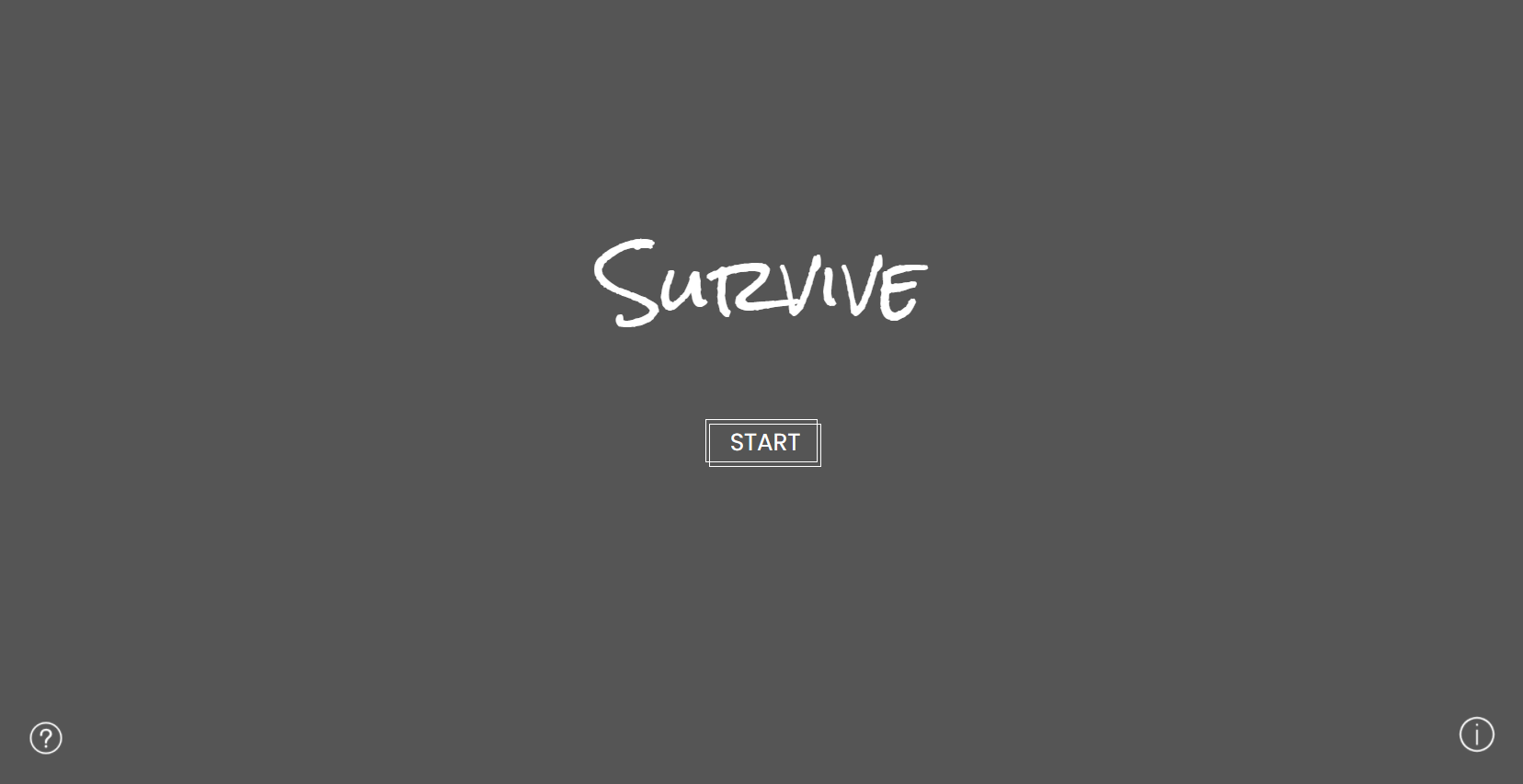
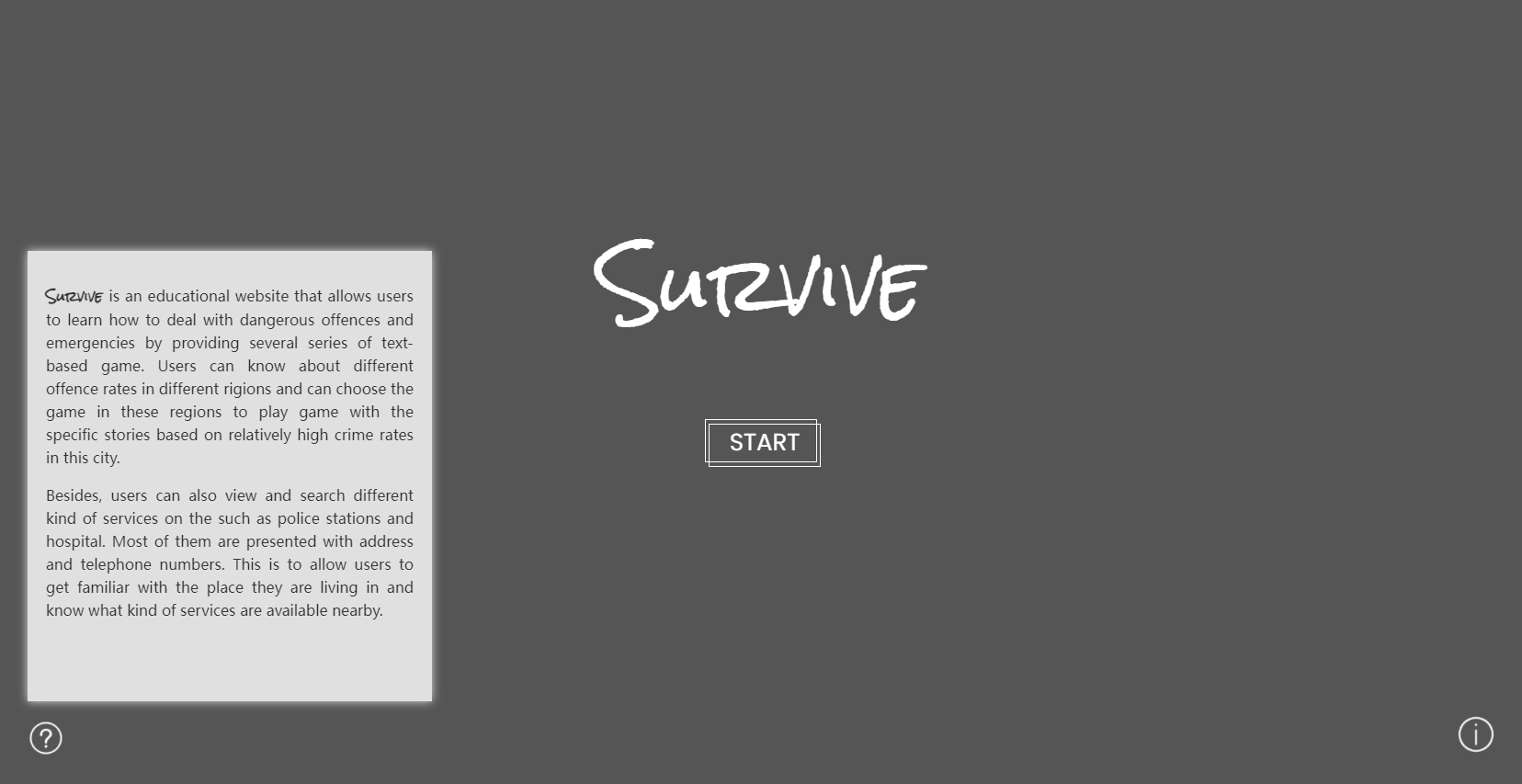
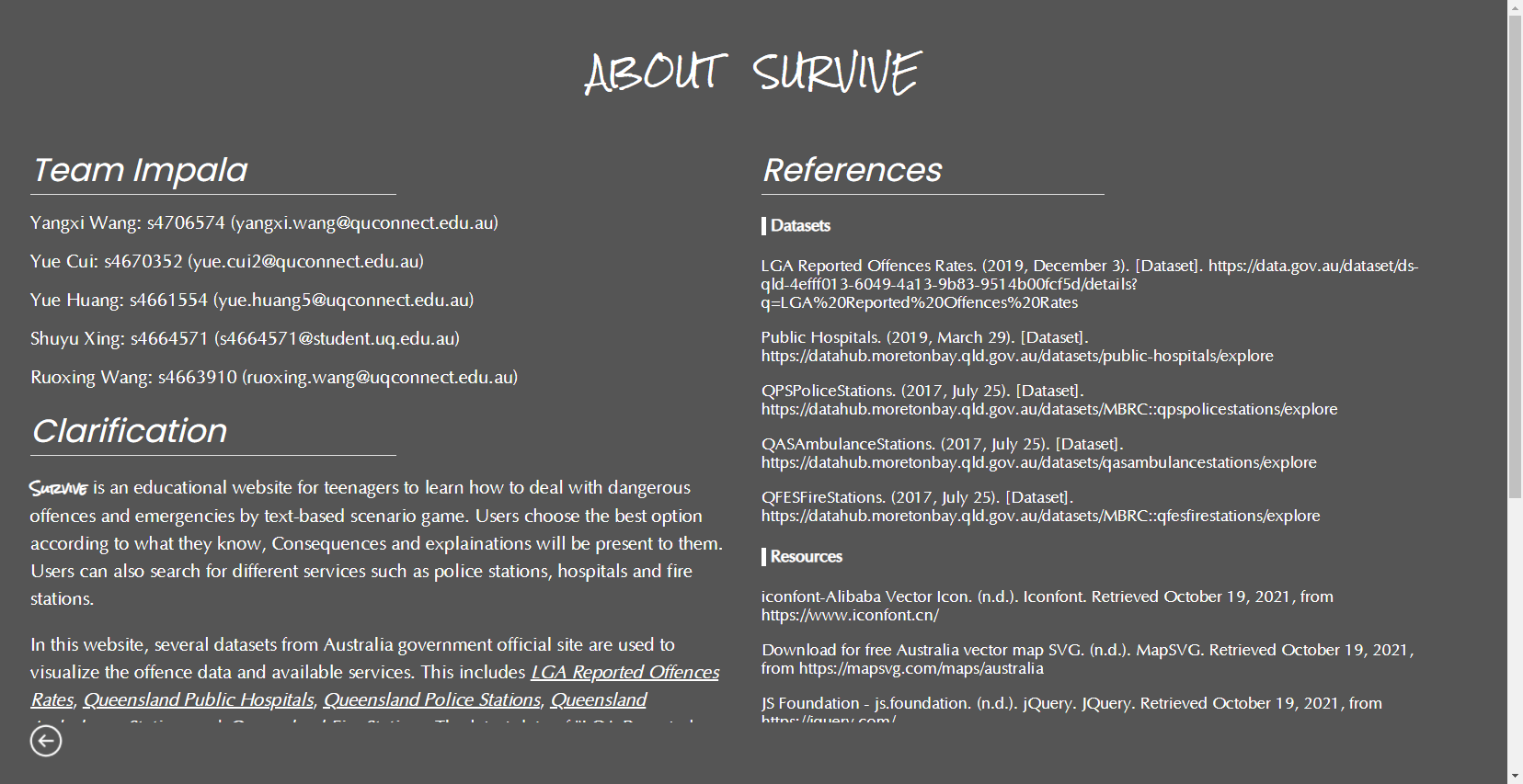
As we started to build the low fidelity prototype, the colour theme was decided as light blue with low contrast and simple shapes and text as contents. With the prototype, we found 3 participants and 1 tutor for a testing session. According to the feedbacks, several participants mentioned that some important features are inconspicuous and sometimes they didn't notice them, even for the choices. I considered this problem could be solved from both the colour theme and the choice presenting. For the colour theme, we decided to use some bright colours. With an idea of retro style and a feeling of old notebook and detective, we tried the colour theme of orange-yellow-brown in the next iteration. Still, it looks weird especially with the real map embedded, and it doesn't feel serious enough as we named it "Survive". Finally, we decide to make it black-white-grey themed, because the topic of safety is about life and death, the high contrast of black and white can present a sense of solemnness and warn users to take it seriously. With key elements such as current choices and services link set to light orange, it could guide users with the whole process and the colour itself provides a sense of safety and hope. For the choices, it does hard to notice as there are lots of colours and icons on the map. We tried the text choices in the next iteration, but the horizontal style looks like users are taking an exam, especially for students. So we decided to make it more like sticky notes, and a pin icon for selected choice.
As we started to refine the layout, it is hard for us to balance the scene image and the map on the same page. Users should see the most important feature when they first enter the page, which is the scene image because it is intuitive. Then the layout should be easy to follow and guide users through the scene, that is reading the description and checking the options and map. With this in mind, we adopted a left/right layout with the scene image taking the largest place. Descriptions and choices are on the right for users to read through, and the map takes place at a corner. Although we have considered an up/down layout with icons leading users' sight, but its asymmetric makes it lack aesthetics, so this proposal was abandoned.
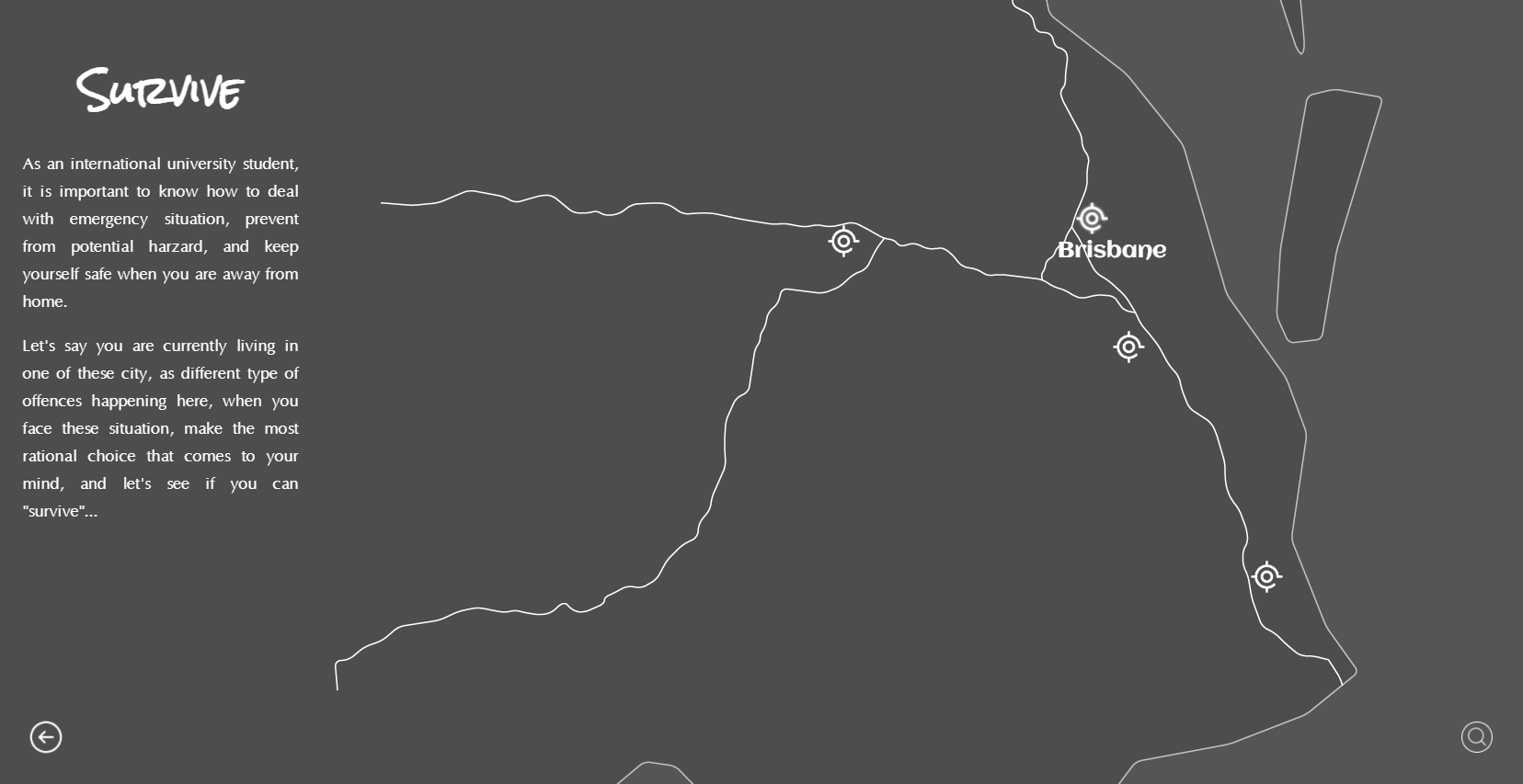
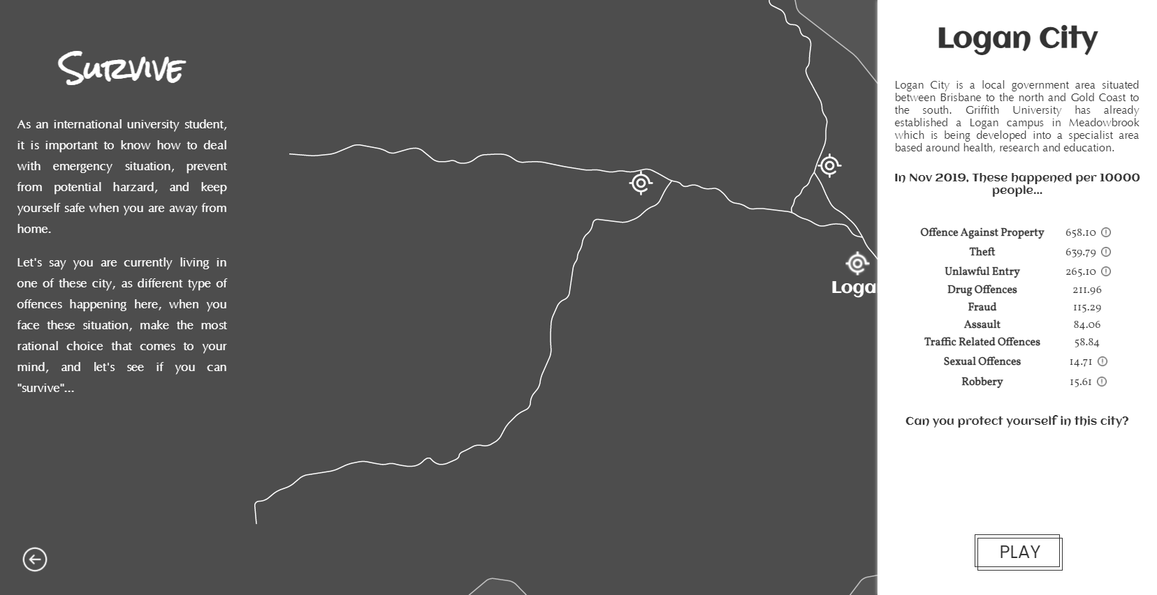
As we came to the game map page, which is the entrance of different games, users choose different cities to see its detailed offences data and start the game. Originally it was designed as a real map of QLD with icons representing cities as the game entrance. But considering previous feedback about our prototype that there are too many elements on this page, this might lead to information overload. And also the colour theme of the map is not compatible. In consideration of simplifying this page and with inspirations from another hand-drawn style website, the map was replaced by a concise and abstract one with outlines and several main roads of QLD visible only. In this case, information can be easily recognized and pins of the city are more conspicuous. The offence rate data and the game entrance could be on a popup window at the right, which is the ocean part of the map.
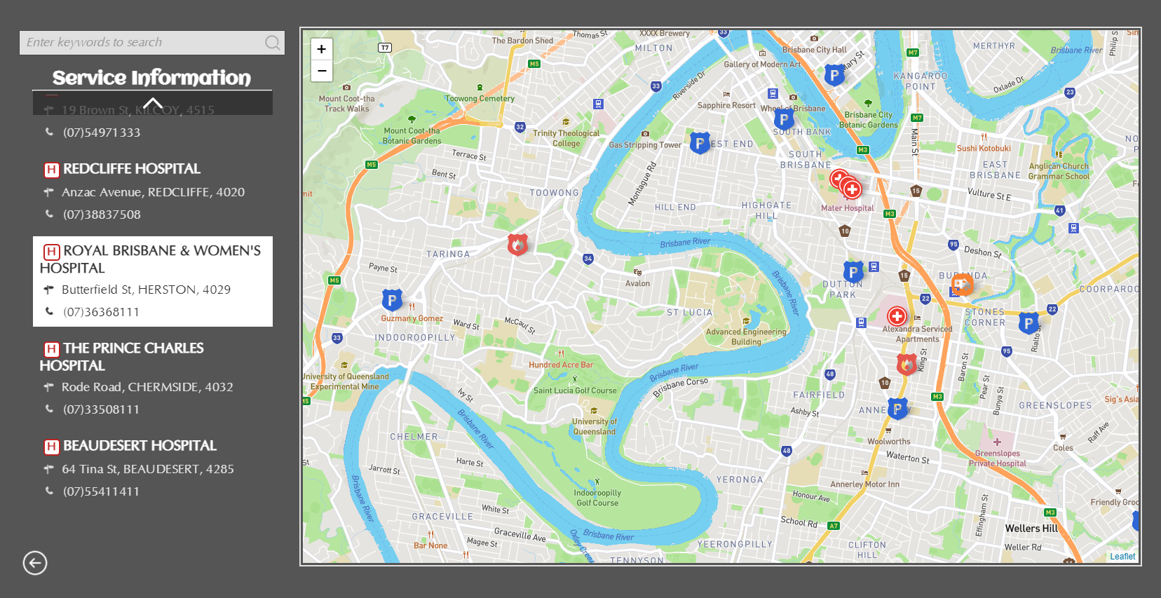
The service map was designed as a common searching page, with the map as the main element, and the searching bar and result list on the left. As not all of the GIS dataset contains text-based addresses and telephone, we decided to fill in the general emergency number 000 for the empty ones for consistency.
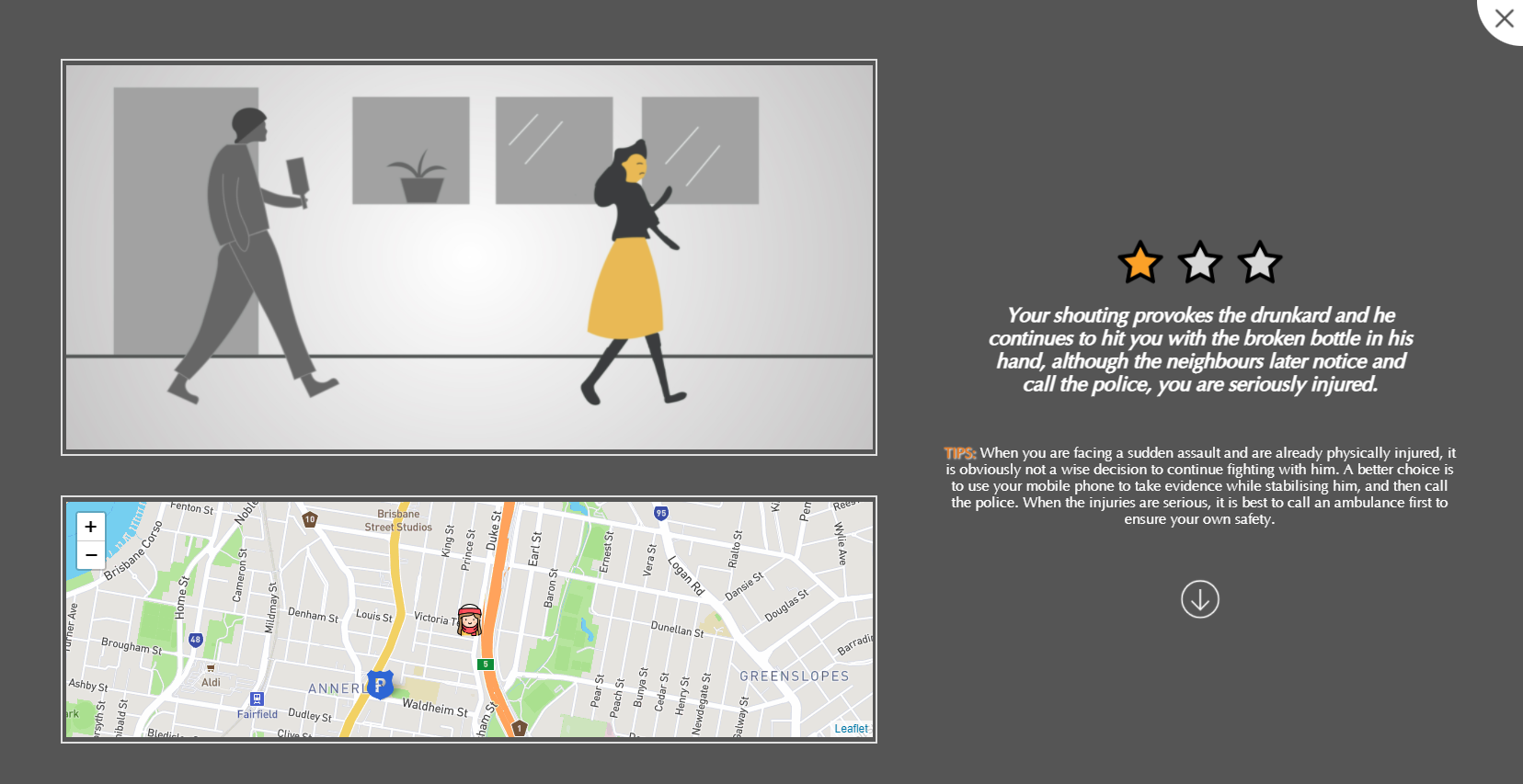
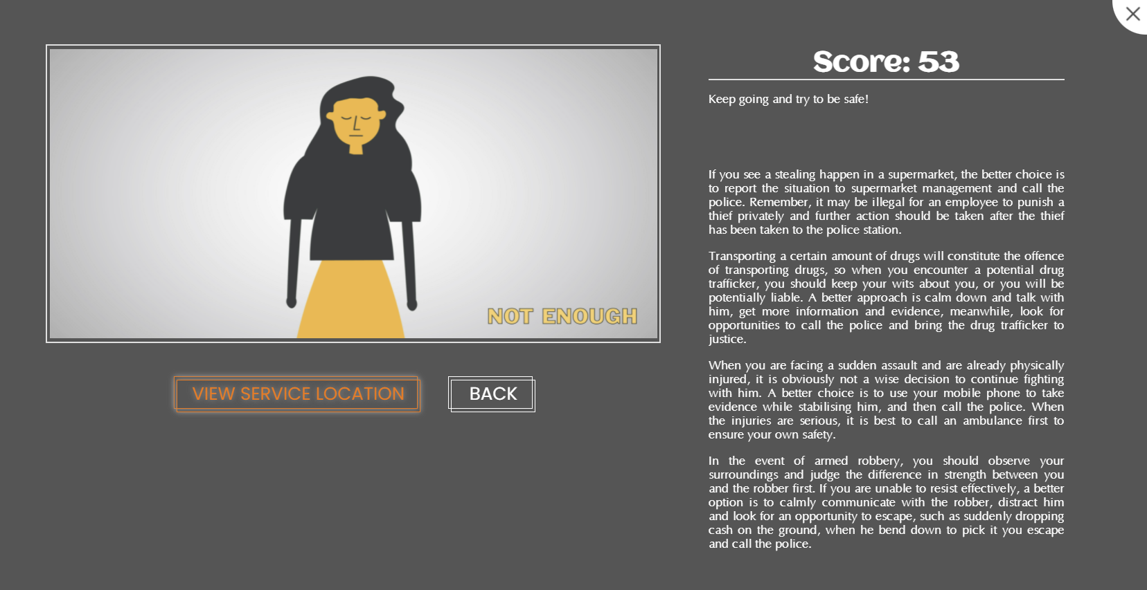
With a refined prototype with a whole game process simulated, another testing session was made and focused more on the game flow and interactions. According to the feedback, the most important issue is it lack of features to let users know whether their choice is good or bad. Even with descriptions at the end, users might forget previous scenes. So we decided to present a text-based consequence after each plot and provide tips for the scene to guide them on what to do when facing this situation. Besides, considering one of the participants' advice, which is adding visualized or quantified results for the game, we decided to add scores for each choice, and a 3-star icon to illustrate the score of each scene. A percentage score and summary will be on the ending page. In this case, users will learn about the options and rationality in time as long as they made the choice.
Implementation
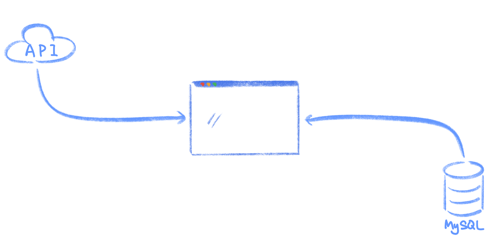
For implementation of the website, MySQL database is used for the storage of game plots and sequences. The story, scene, choices, and other additional information were designed in seperated tables and loaded after each choice was made. The map was implemented utilizing Leaflet.js to present the geographical information and the location of the services were extracted from datasets by POST request using AJAX. Besides, simple animations created by CSS were added in the game feature such as fade in/out and slide in/out, that is to present a coherent experience while going through these game plots.


Reflections
For the project, although the final product still have some problems and potential improvements to be made, generally the current website can meet the need of safety education we have proposed at the beginning and have made a functional website that provides with essensial safety knowledge for students. We believe that the whole process and outcomes are successful, We also realized that a good functionality is important than some cool visual effects. However, regardless some limitations of this course and technical issues, the website could have more features. Such as adjusting map location according to users' location so university students from all over the world can use it. And the game could be more interesting if the story is designed as branched instead of linear, so users can have completely different storylines made by themselves.